The Food Rush
Website not live

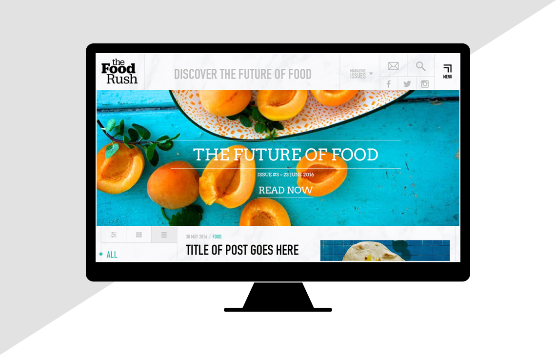
The Food Rush is a blog and digital magazine about food technology. With the director coming from an engineering background, it offered an excellent opportunity to try out some interesting ideas for navigation and interaction.
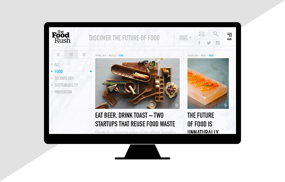
We wanted to give the reader, linear and non-linear ways to explore the site. The blog landing page, can be viewed in a masonry format or as a list. The categories are always visible and as the user scrolls the relevant category is highlighted.
We used a consistent style for navigational elements, from the navigation menu, to "see more" call to actions. Content can be explored horizontally and vertically.
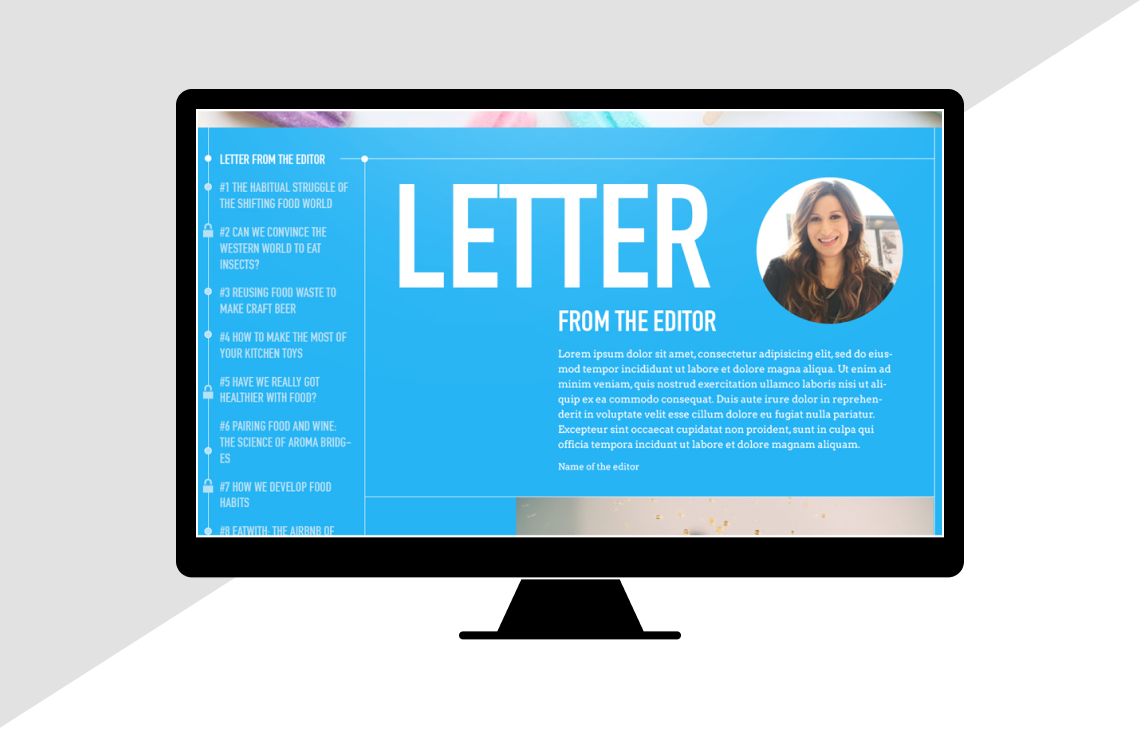
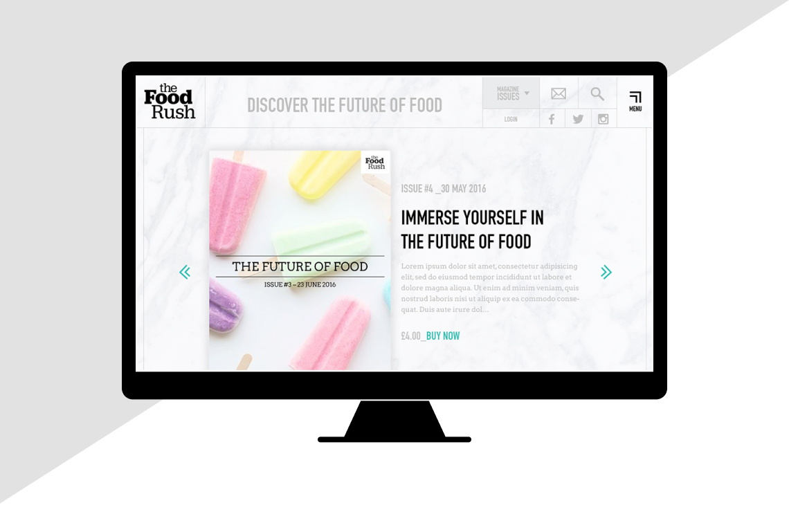
The blog will contain quarterly digital magazines. Each one will be art directed, so we've created a template that can cope with this. A selection of articles are housed behind a subscription barrier. We've used "locked" icons, visible on the contents list, articles list and articles so the user is always aware what is available.
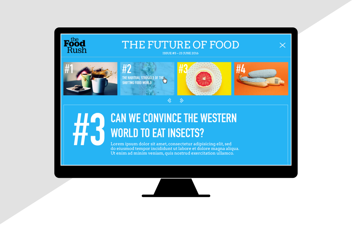
On the magazine article pages, other articles are accessible from a top sliding navigation. So that more content is always offered.
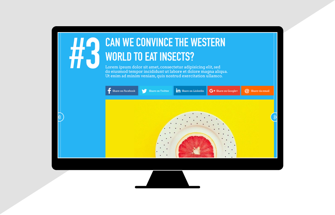
Next and previous articles can be navigated to via arrow call to actions on the edges of the screen.
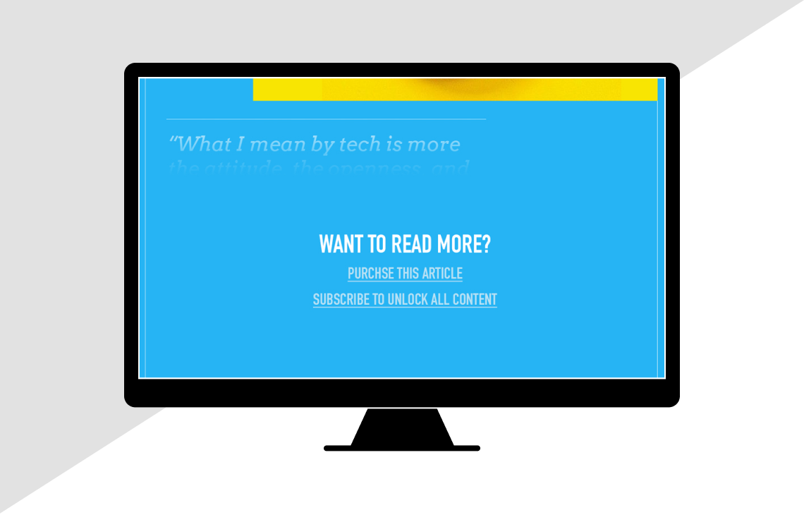
A subscription barrier gives a taster of the article and a friendly call to action to subscribe.
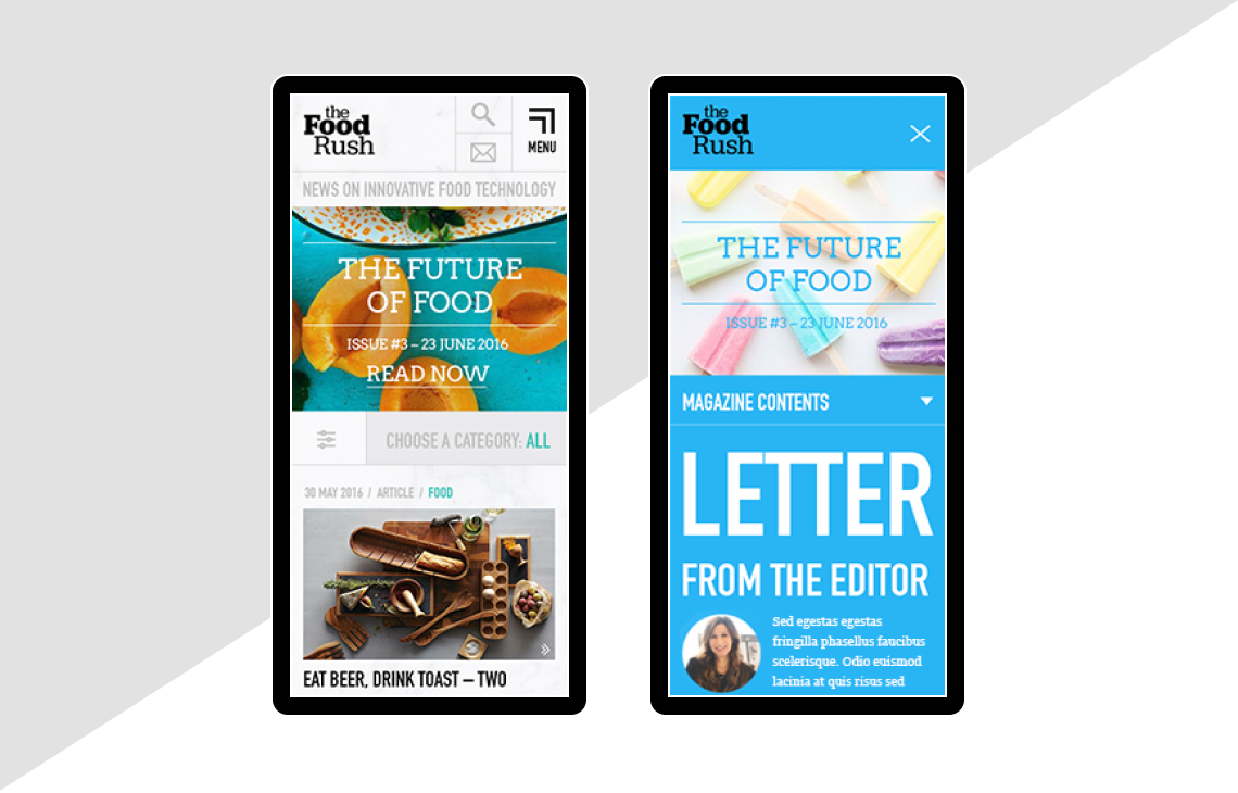
Both the blog and magazine will be fully responsive with full functionality across all viewports.